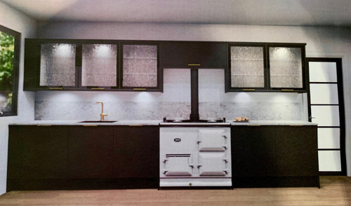
kitchen layout - which looks better ?
poppophouse
6 months ago
last modified: 6 months ago

Featured Answer
Sort by:Oldest
Comments (14)

Daisy England
6 months ago
poppophouse
6 months agoRelated Discussions
Kitchen help - what can we do to make it look better?
Comments (65)Depending on how far you budget goes, I would look at adding traditional cornice and pelmet and replacing the plinth with a similar oyster colour. End panels for wall units could also be replaced / added. Some chessboard style tilling in 3 colours would also bring out the walls. It's hard to tell but is the oak surround also on the wall units? I haven't checked your location but this is something we can help with...See MoreIsland unit vs peninsular - which kitchen layout do you prefer?
Comments (1)I think kitchen islands work better in larger rooms, to help break up the space. The second would work better to increase the feeling of space so I guess it depends on your situation but I like both!...See MoreWhich is better. Kitchen A or B?
Comments (15)Yes, i think my dad was either low on budgetz or... He wqs just too tired to build a toilet for that one house. Anyway, I agree the new flow is much more inviting & i the kitchen is mid size, coz if I were to create as the plan, it would be around a 14' by 10' kitchen. A big on the budget, but doable. I would not though have a big Living/lounge. So, I will just utilise one of the 180sqft bedroom as a living (we don't really have that much furniture to fill a 360sqft living room!) . The other Bedroom left as it is (storage since we don't have a storage area/room). Maybe in future i will expand on that. Maybe, I'll upload some pictures of the after someday! Thanks....See MoreStruggling with part of kitchen layout - which would you choose?
Comments (9)@Leesha- the illustrations shows side by side ovens that do not match. Some manufacturers now make appliances designed to sit side by side where the control panels are the same size and the handles are at the same height so even if you put a single oven with a steam oven side by side with a coffee maker, microwave and warming drawer the horizontal lines will line up. Look up Seimens ovens to see some images...See More PRO
PROPlews Garden Design
6 months ago
CWD
6 months agoJen
6 months ago
Tani H-S
6 months ago
Anna G
6 months ago
Nikki Larsen
6 months agopoppophouse
6 months agosiobhanmcgee90
6 months agosiobhanmcgee90
6 months ago
Isla Cherry
5 months ago


Sonia